


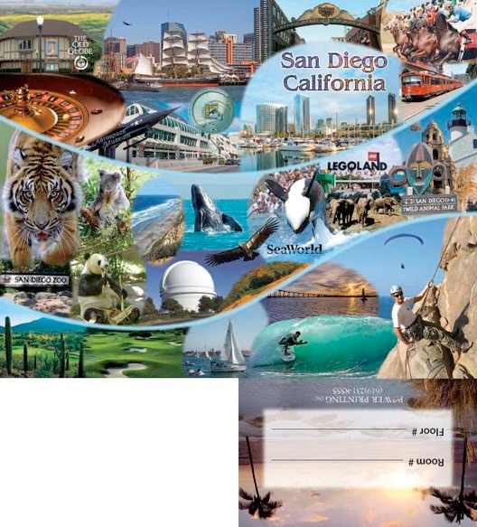


The project to the right was done for Power Printing and is a hotel key card holder. Over three dozen photos were blended in Photoshop for the final image. It was then laid out and typeset in InDesign. It has two folds, one vertically down the center, and one horizontally where the flap meets the cover.
To the right is the outside front cover for Mesa College. The challenge on this piece was that the customer wanted to use both pictures. Unfortunately they did not have high resolution files of both of them. I gave them each paint-like filter treatments to make them appear equal.
This was the holiday card done for the Educational Cultural Complex. They had at first requested concepts using red poinsettias. When the customer saw the comps they decided that they looked too Christmassy and requested something more nondenominational. I came up with the peace dove, which they loved.
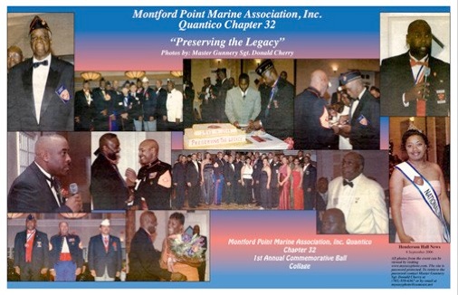
This is the center spread for a commemorative book made for the people that had attended the event. It was recreated from a newspaper article. All of the photos were scanned from newsprint and de-screened. Then the contrast and color were adjusted and specks and creases from the newsprint removed. The background was created with a custom gradient to match the original. They were then imported into QuarkXPress to compose and typeset.
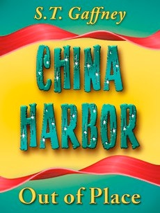
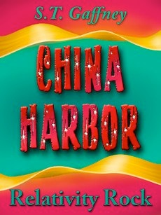
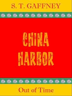
The three images above are book covers. The customer had already chosen her color palette as well as the decorative font she wished to use for the titles. She was very particular about the exact shade of red, green and yellow that were used. All three covers had to look related but different.
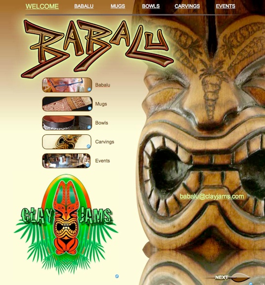
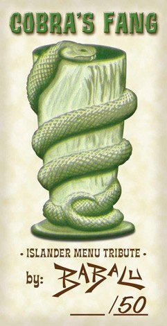
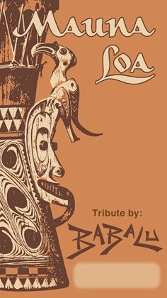
The card above was made for a recreation of a famous ceramic tiki mug, and the one below done as a tribute to a famous restaurant. The image to the right is the home page of the website I created for the same artist. clayjams.com
The card above is a postcard for an alternative energy startup company.


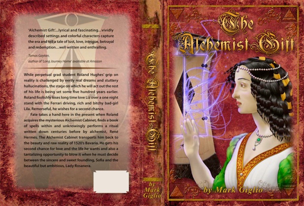
The portrait of the woman on this book cover was created in Illustrator based on paintings of the Renaissance era.
The cupboard was a photo of a furniture piece that the author created himself. The glows and textures were done in Photoshop and the text was set in InDesign.
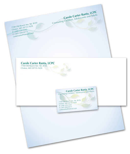
This stationary package was created for a client who is a counselor. I chose Optima as a font because it is friendly, open and easy to read.
I also picked a soothing calming color palette of pale blues and greens. The fresh leafy branch indicating new growth was created in illustrator. The jobs were laid out and typeset in InDesign.

The Christmas card below was created for the print shop I was working for. The ornaments were done in Photoshop using shapes, gradients and layer effects. The background used various brushes and blend modes. The text set in the bold font Impact was gently shaded with gradient overlays. I took the company logo and distorted it around one of the ornaments.
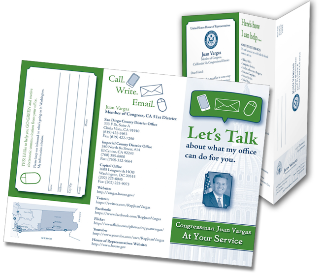
The 3 panel 2 color brochure to the right, for Congressman Juan Vargas has a Business card and a tear off return postcard. It was typeset and assembled in InDesign. The odd thing about this job was the size requirement of the photo. It could be no larger than 2.7 square inches.
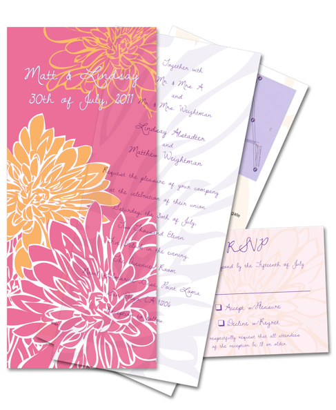
The interesting part of this wedding invite was the transparent cover sheet. It was designed to fit in a standard #10 envelope.The floral images were created in Illustrator using the 3 colors of the wedding party, orange, fuchsia and purple. The text was set and images were assembled in InDesign.
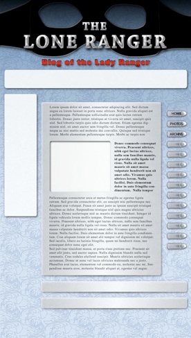
This is a blog page I designed for a client in Roanoke. She is a Lone Ranger enthusiast and knows just about everything there is to know about the original radio show and the TV series starring Clayton Moore.
The postcard above had many individual photos that I color corrected and masked in Photoshop. The photos, gentle gradient background and text were all assembled in InDesign.
The postcard to the right was for a night club. I had to separate the logo from it’s background since the customer only had a jpeg with a white box around it. I also had to re-create the sign on the brick wall. The original photo was very badly lit and out of focus. I then incorporated an unusual texture and masked it with brushes.
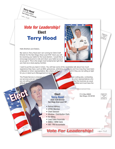
To the left is a letter and direct mail postcard package for a political hopeful. I scanned and color corrected his photos, assembled and typeset everything in InDesign.
Above is a logo for the Police Officers Association. They wanted realistic representations of their badge and shoulder patch. I used photos of the actual items and redrew them in Photoshop using the pen tool. Then I colored them by applying gradients and layer styles.
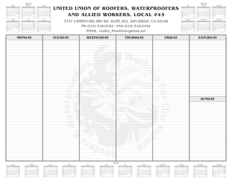
This is a one color desk calendar. I created and typeset all of the small calendars around the edge as well as the main grid in the center. Then I added their logo to the center screened way back to allow for easy legibility of any writing. I also picked the lively and interesting font Benguiat for the text.
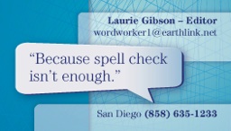
For this BC and flyer I chose the color blue to denote trust and the classic Century font family for reliability. I used a word balloon shape to pop the tagline. Round cornered boxes were used in varying opacities with gradients and shadows for interest. In the background I added a linear texture for excitement.
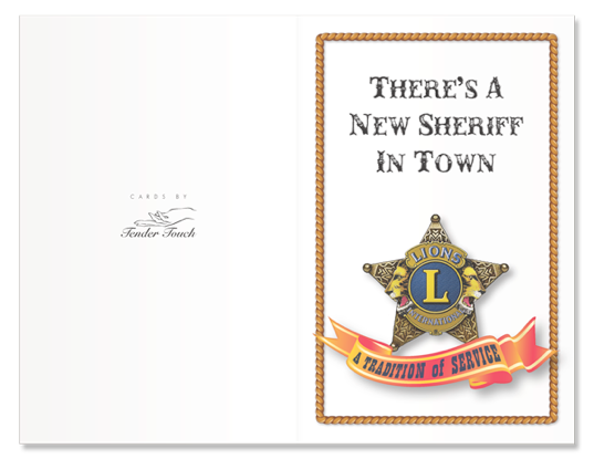
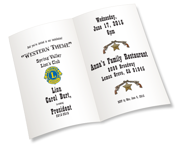
This invite was done for a friend to celebrate her installation as President of her Lion’s Club Chapter.
Logo designed in InDesign for a local teacher’s association.
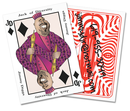
The calling card to the right was created to emulate a playing card. Instead of the business card size of 2x3.5 it is 2.5x3.5. Images were drawn in Illustrator using the pen tool. Patterns and gradients were used to color.


The door hanger and postcard were created as marketing tools for a local plumber. He in particular, loves Yelp!
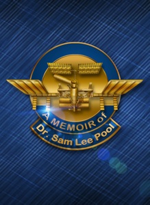
This was a cover for a book to commemorate the life of Dr. Sam Lee Pool, who worked on the Space Lab.

A business card for an architectural company. Combining the plain font Myriad with the script font Salto.
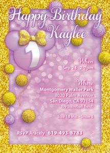
Birthday party invite celebrating the first year of Kaylee.
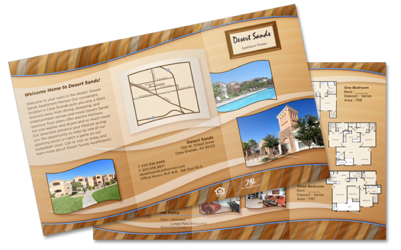
This was a brochure extolling the virtues of a desert community.

DESIGN & PRODUCTION WORK
Above, is the customer mockup provided for the book covers.
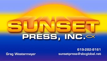
Above, a business card for a San Diego printing company.
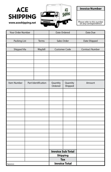
Above a shipping invoice in one color.